Problem Scoping
Two problems, not one
My role started as a UX analysis brief: evaluate the minigames and identify what wasn't working. But as I dug in, it became clear that many of the issues I was finding were inseparable from how the minigames were being presented to the player. Feedback gaps, readability problems, and mechanical confusion weren't just game design issues — they were UI issues. So, alongside the critique, I took on designing HUD concepts for several of the minigame ideas, translating the recommendations from my analysis directly into visual solutions.
Key Problems to Solve:
UX Minigame Analysis
The screen was only half of the problem
The minigames are presented to the player with the action and a timer, with the UI covering most of their FOV.
1: "Tough Luck Kid" (passive wait)
The goal reads clearly with a timer, but the mechanic lives or dies on two variables the game controls entirely: duration and frequency. Wait too long and it becomes frustrating; show it too often and the joke goes stale. Recommended: careful tuning of both, plus a humorous image or sound to land the joke at the player's expense.
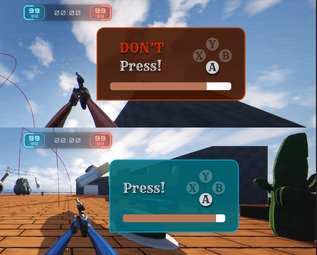
2: "Press [Button]"
Clear and simple on its own, but repeated appearances created an unintended problem: players conditioned to this minigame would get "Press The Sequence" and treat it the same way, mashing without reading. Recommended: weighted randomness across all minigames to prevent back-to-back repetition of any single variant.
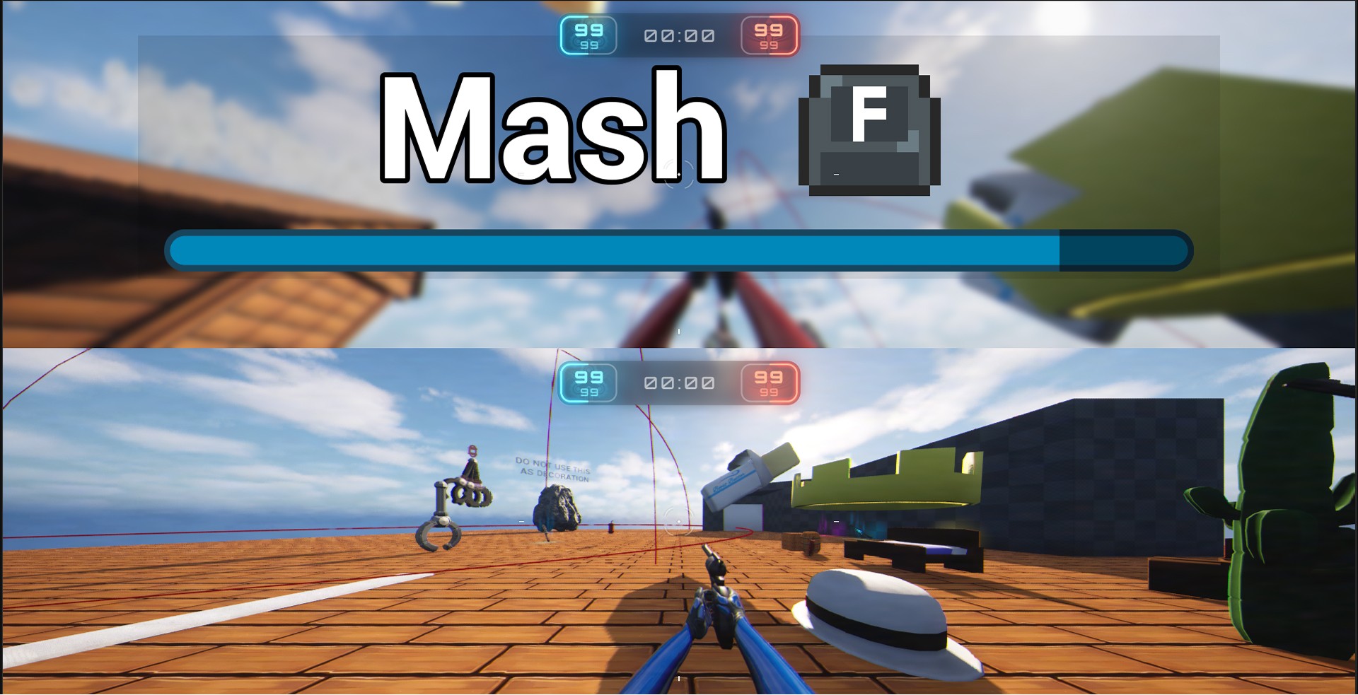
3: "Mash [Button]"
The shared timer bar caused a readability conflict here. Players intuitively expect a mash bar to fill up as they succeed, but since the bar functions as a countdown, it depletes regardless of performance. Recommended: a dynamically color-shifting bar (red → yellow → white, like cooling metal) to make it feel distinct and progress-responsive. Correct inputs trigger a "sizzle" sound and a cool blue-white flash; wrong inputs trigger a "stoked fire" sound and the bar rises slightly — a full multisensory feedback system mapped to a single mechanic.
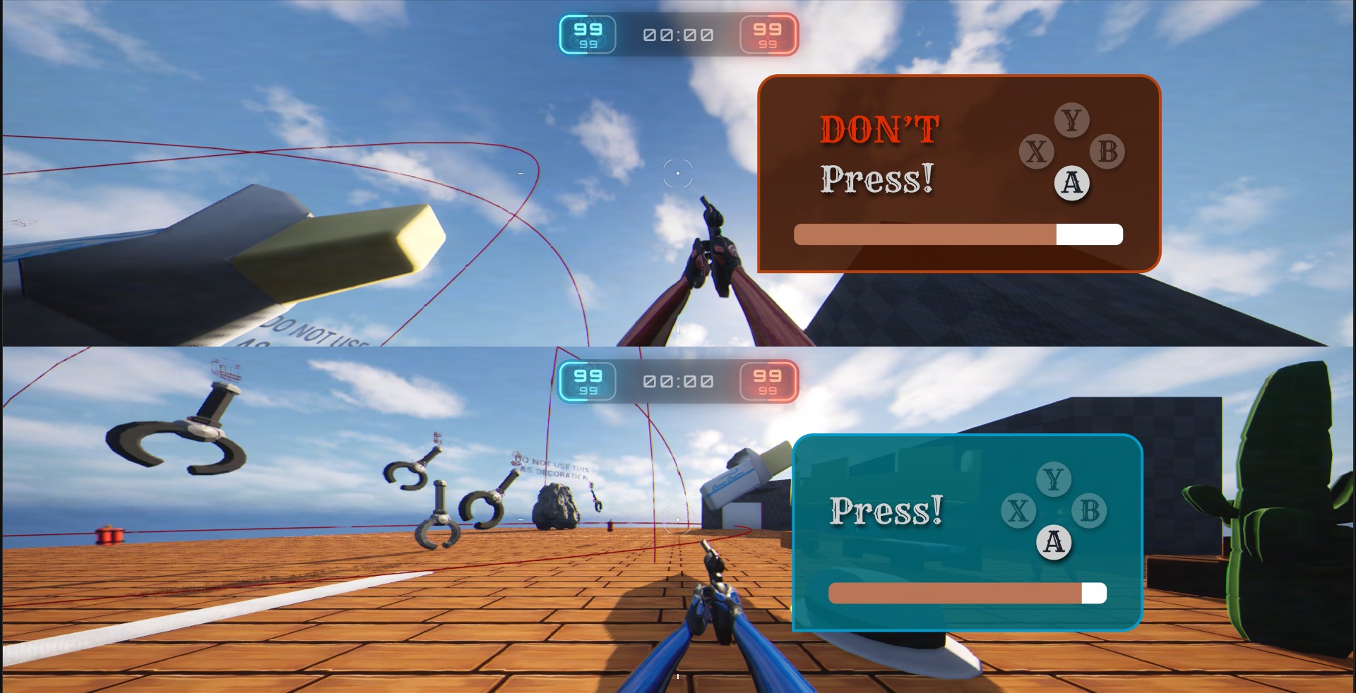
4: "Don't Mash [Button]"
The red text does good work distinguishing this from "Press [Button]," and the troll intention is clear. But the failure feedback wasn't strong enough: if players don't immediately understand what they did wrong, the joke doesn't land — it just reads as a bug. Recommended: prioritize clear, immediate failure feedback above everything else here. Also flagged that this minigame functions identically to "Tough Luck Kid" from a mechanics standpoint; both ultimately just make the player wait, which reduces overall variety.
5: "Press Any Button Except [Button]"
Text is clear, but identified a timing exploit: players spamming inputs right as the minigame triggers could complete it accidentally before reading it. Flagged for input grace period handling.
6: "Press a Button and Hope It's the Correct One"
Three unlabeled options with no indication of which is right created two failure modes: lucky players completing it without understanding why, and unlucky players cycling through it multiple times getting wrong each time. Recommended: reduce to a 50/50 — two options — and explored a coin flip framing ("Quick! Heads or Tails?") to make the luck feel intentional and fun rather than arbitrary.
7: "Wait for It… Press [Button]"
The loading spinner read as a technical loading state, not an intentional game mechanic. Recommended: replace with a deliberate timing signifier (hourglass, clock) or reframe as a rhythm mechanic where the button slowly appears and players must hit it at the right moment, making the wait feel like skill rather than a bug.
8: "Press The Sequence"
Correctly pressing a button had no feedback other than the text changing, which risked players continuing to mash the previous button. Recommended: add a clear per-press confirmation signal — visual flash, sound, or haptic — so each correct input registers unmistakably.
UI Design
A system, not eight separate screens
With the critique informing my understanding of each minigame's unique needs, I designed the HUD system that wraps them, built to work consistently across all variants while giving each the right visual context.
Key Decisions
Prompt placement near the crosshair
Keeps the player's eye-path intact during a high-stakes combat moment. Pulling eyes to a corner costs time players don't have.
Timer bar directionality
Resolved in direct response to the "Mash" critique: the bar's behavior had to be legible differently per variant, which informed the color-shift recommendation and the decision around fill vs. deplete direction.
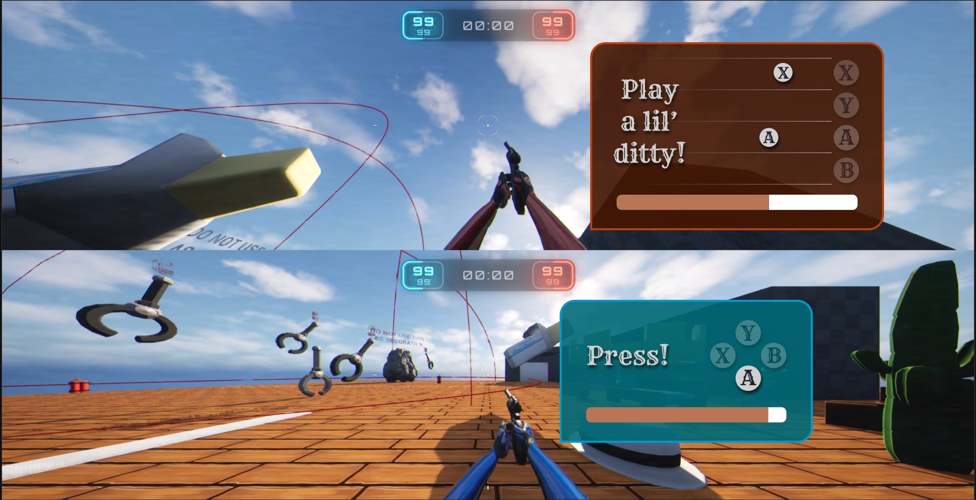
Button reference cluster (Y/X/B/A)
Designed to work accessibly across all minigame types without rebuilding per variant, accounting for both controller and keyboard inputs.
Penalty state feedback
A flash of red: visceral enough to communicate failure clearly, restrained enough not to break the game's tone.
My design tackles two issues: 1. the minigame HUD taking up the entire screen and 2. displaying the button layout for controller players. Players using controllers sometimes mistakenly click the wrong button due to it's placement. By showing the layout, it will help the player spatially recognize where the button is.
In Figma, I made mockups of different types of minigame ideas, including a rhythm based minigame where the player must hit a series of buttons at the right time.
Reflection
Analyzing the system led me to design for it
The UX critique shaped the deliverable
I came in to critique a set of minigames. What I ended up doing was both that and designing UI concepts for them, because the feedback gaps I kept identifying couldn't be fully communicated in writing alone. Showing what a dynamic color-shifting progress bar or a rhythm-based timing mechanic could look like made the recommendations concrete in a way that a bullet point couldn't. This visual feedback greatly helped feedback and brainstorming sessions with the game's developer.
The line between fun frustration and confusing frustration is feedback
The most interesting design tension I encountered was in the troll minigames. "Don't Mash" and "Tough Luck Kid" are designed to frustrate the player on purpose — but there's a meaningful difference between fun frustration and confusing frustration. The line between them is feedback. If the player knows they got trolled, they laugh. If they don't know what happened, they just feel cheated. That reframing — feedback as the mechanism of tone, not just usability — is something I'll carry into every project going forward.
Next Steps
With more time, I'd expand the UI prototypes to interactive builds with simulated feedback states — sound, animation, color response, so the recommendations could be felt rather than just read. I'd also push for player testing on the troll variants specifically, since "does the joke land?" is a question only fresh eyes can answer. And I'd bring the mechanically redundant variants back to the team with a concrete proposal: either differentiate them enough to earn separate slots in the rotation, or consolidate and strengthen one.


