Reimagining the Walmart Pharmacy Pickup Experience

Reimagining the Walmart Pharmacy Pickup Experience

Reimagining the Walmart Pharmacy Pickup Experience

How might we improve the prescription pickup experience for Walmart Pharmacy customers and pharmacy technicians alike? In this research and holistic service design project, I explore exactly how to do this.

How might we improve the prescription pickup experience for Walmart Pharmacy customers and pharmacy technicians alike? In this research and holistic service design project, I explore exactly how to do this.

How might we improve the prescription pickup experience for Walmart Pharmacy customers and pharmacy technicians alike? In this research and holistic service design project, I explore exactly how to do this.

Process

  • Contextual Inquiry

  • Surveying

  • Sketching

  • Prototyping

  • User Journey Mapping

  • Task Flow Analysis

  • User Testing

  • Contextual Inquiry

  • Surveying

  • Sketching

  • Prototyping

  • User Journey Mapping

  • Task Flow Analysis

  • User Testing

  • Contextual Inquiry

  • Surveying

  • Sketching

  • Prototyping

  • User Journey Mapping

  • Task Flow Analysis

  • User Testing

My Role

  • Independent UX Researcher

  • Independent UX Researcher

  • Independent UX Researcher

Timeline

  • 7 months

  • 7 months

  • 7 months

Tools Used

Tools Used

  • Figma

  • FigJam

  • Claude AI

  • Qualtrics

  • Perplexity AI

  • Figma

  • FigJam

  • Claude AI

  • Qualtrics

  • Perplexity AI

  • Figma

  • FigJam

  • Claude AI

  • Qualtrics

  • Perplexity AI

Project Overview:

Project Overview:

Project Overview:

The Problem:

The Problem:

The Problem:

While the Prescription pickup process at Walmart Pharmacy is streamlined, there are still snags in the process that disrupts the customer's and pharmacy technician's experience. These issues stem from the pharmacy software used, the gaps in communication from the pharmacy to the customer, and minor flaws in the process that when fixed, can easily improve the experience for all.

While the Prescription pickup process at Walmart Pharmacy is streamlined, there are still snags in the process that disrupts the customer's and pharmacy technician's experience. These issues stem from the pharmacy software used, the gaps in communication from the pharmacy to the customer, and minor flaws in the process that when fixed, can easily improve the experience for all.

While the Prescription pickup process at Walmart Pharmacy is streamlined, there are still snags in the process that disrupts the customer's and pharmacy technician's experience. These issues stem from the pharmacy software used, the gaps in communication from the pharmacy to the customer, and minor flaws in the process that when fixed, can easily improve the experience for all.

The Solution:

The Solution:

The Solution:

In order to make not only the pharmacy employee's job easier, but to improve the customer's pharmacy experience, I aim to accomplish two goals:

  • Tackle the flaws in the Connexus system to improve pharmacy technician workflows through integrated patient profiles, bulk insurance updates, and streamlined checkout processes that decrease customer wait times, especially for patients with prescription issues.

  • Introduce self-service capabilities that empower customers to manage their pharmacy experience independently through status checks, prescription expediting, and queue management while maintaining HIPAA compliance.

In order to make not only the pharmacy employee's job easier, but to improve the customer's pharmacy experience, I aimed to accomplish two goals:

  • Tackle the flaws in the Connexus system to improve pharmacy technician workflows through integrated patient profiles, bulk insurance updates, and streamlined checkout processes that decrease customer wait times, especially for patients with prescription issues.

  • Introduce self-service capabilities that empower customers to manage their pharmacy experience independently through status checks, prescription expediting, and queue management while maintaining HIPAA compliance.

Projected Impact:

Projected Impact:

Increase the pharmacy technician's efficiency (and therefore, decrease the patient's wait time) by 20-25%

Increase the pharmacy technician's efficiency (and therefore, decrease the patient's wait time) by 20-25%

What's Wrong with the Current Process?

What's Wrong with the Current Process?

What's Wrong with the Current Process?

Working alongside pharmacy technicians and pharmacists that have years of experience for several weeks allowed me to do a sort of contextual inquiry, learning how pharmacy technicians utilize the tools required to perform their jobs. All expressed the same struggle: the pharmacy software used is clunky, hard to learn, and not user friendly.


Thus, my initial goal was found: redesign the pharmacy software for pharmacy technicians/pharmacists.

The Software Everyone Loves to Hate: Pharmacy Software "Connexus"

The Software Everyone Loves to Hate: Pharmacy Software "Connexus"

The Software Everyone Loves to Hate: Pharmacy Software "Connexus"

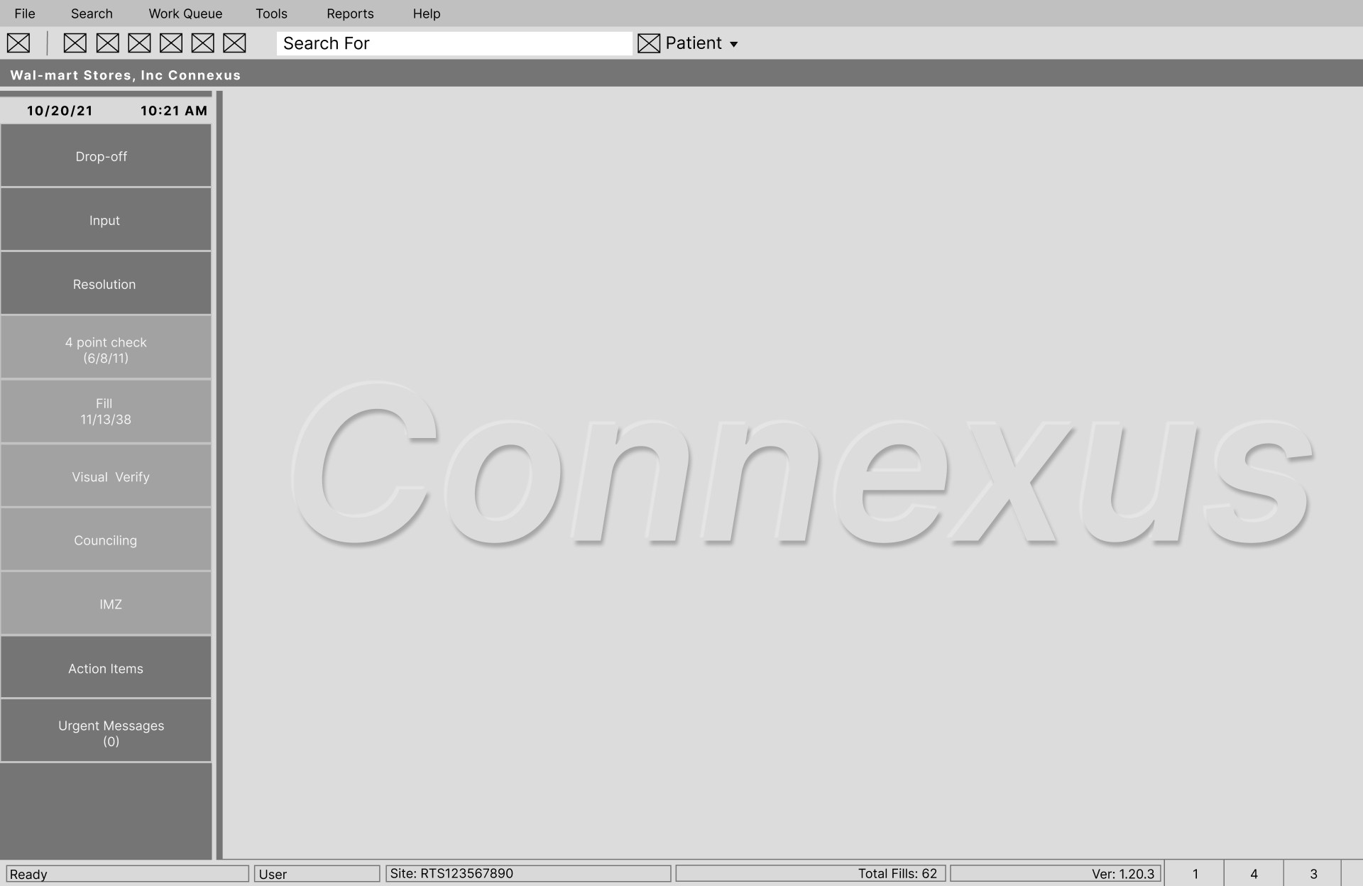
While I was unable to obtain screen captures of the software, I was able to recreate two screens within Figma to show the current UI of the home screen and checkout screen, respectively.

While I was unable to obtain screen captures of the software, I was able to recreate two screens within Figma to show the current UI of the home screen and checkout screen, respectively.

While I was unable to obtain screen captures of the software, I was able to recreate two screens within Figma to show the current UI of the home screen and checkout screen, respectively.

Home Screen

Home Screen

Checkout Screen

Checkout Screen

After contextual inquiry with pharmacists and technicians, as well my own use of the software, I identified these main issues:

After contextual inquiry with pharmacists and technicians, as well my own use of the software, I identified these main issues:

After contextual inquiry with pharmacists and technicians, as well my own use of the software, I identified these main issues:

Wasted Space

The interface contains significant wasted space and functionality. Grayed-out side menu buttons on the home screen are inaccessible to pharmacy technicians (pharmacist-only features), while the on-screen keyboard at checkout serves no purpose since the terminals aren’t touch-enabled. These unused elements clutter the interface without adding value to the technician workflow.

The interface contains significant wasted space and functionality. Grayed-out side menu buttons on the home screen are inaccessible to pharmacy technicians (pharmacist-only features), while the on-screen keyboard at checkout serves no purpose since the terminals aren’t touch-enabled. These unused elements clutter the interface without adding value to the technician workflow.

Checkout Screen - Patient Profile Navigation is Too Time Consuming

Updating patient information during checkout requires technicians to exit the process entirely, navigate to the home screen, make changes, and restart checkout from scratchcreating unnecessary delays for both staff and customers.

Updating patient information during checkout requires technicians to exit the process entirely, navigate to the home screen, make changes, and restart checkout from scratchcreating unnecessary delays for both staff and customers.

Some solutions that could fix these problems include:

Some solutions that could fix these problems include:

Some solutions that could fix these problems include:

Modernize the UI

Reduce the wasted screen space by improving the navigation/work flow. Put the most used features front and center, and use tabs to easily navigate between them.

Reduce the wasted screen space by improving the navigation/work flow. Put the most used features front and center, and use tabs to easily navigate between them.

"Combine" the checkout and main screens

By having the checkout screen be a part of the main screens, users could easily view the patient's info and checkout info, all on the same screen. This would prevent the users from having to restart the checkout process.

By having the checkout screen be a part of the main screens, users could easily view the patient's info and checkout info, all on the same screen. This would prevent the users from having to restart the checkout process.

But Wait—Who Am I Actually Solving For?

But Wait—Who Am I Actually Solving For?

But Wait—Who Am I Actually Solving For?

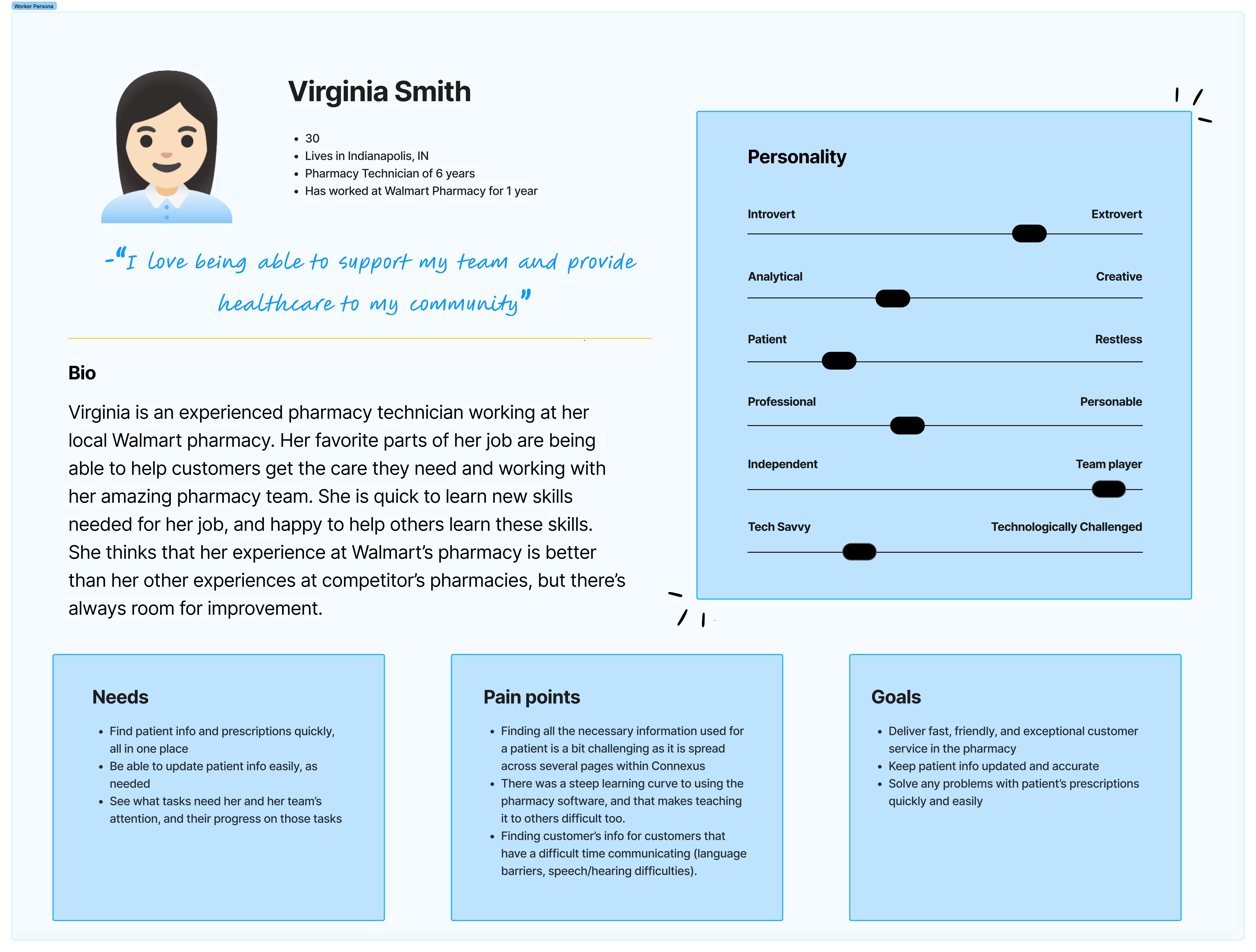
To better understand who I am designing for and to keep them central in my process, I created a user persona of a pharmacy technician based on my observations.

To understand the current struggles and needs of the users, I created a user persona that embodies a Walmart Pharmacy Technician.

The Pharmacy Technician: Virginia

The Pharmacy Technician: Virginia

The Pharmacy Technician: Virginia

A user persona of a walmart pharmacy technician, including pain points, goals, and needs.

Virginia's Main goals are:

Virginia's Main goals are:

Virginia's Main goals are:

  • Provide a fast, friendly, and exceptional customer service for pharmacy customers.

  • Solve issues with customer's prescriptions easily and quickly.

  • Keep patient and prescription info updated and accurate.

  • Provide a fast, friendly, and exceptional customer service for pharmacy customers.

  • Solve issues with customer's prescriptions easily and quickly.

  • Keep patient and prescription info updated and accurate.

Virginia's Pain Points are:

Virginia's Pain Points are:

Virginia's Pain Points are:

  • Finding all the needed info use in the pharmacy for day-to-day tasks is challenging, as it is spread throughout several pages, softwares, etc.

  • The software used is dated and had a steep learning curve, which makes it difficult to teach to new technicians too.

  • Finding a patient's info that has difficulty communicating (language barriers, hearing/speech difficulties) can be challenging, as their name and date of birth are needed.

  • Finding all the needed info use in the pharmacy for day-to-day tasks is challenging, as it is spread throughout several pages, softwares, and hardwares.

  • The software used is dated and had a steep learning curve, which makes it difficult to teach to new technicians too.

  • Finding a patient's info that has difficulty communicating (language barriers, hearing/speech difficulties) can be challenging, as their name and date of birth are needed.

The Technician's Experience: User Journey

The Technician's Experience: User Journey

The Technician's Experience: User Journey

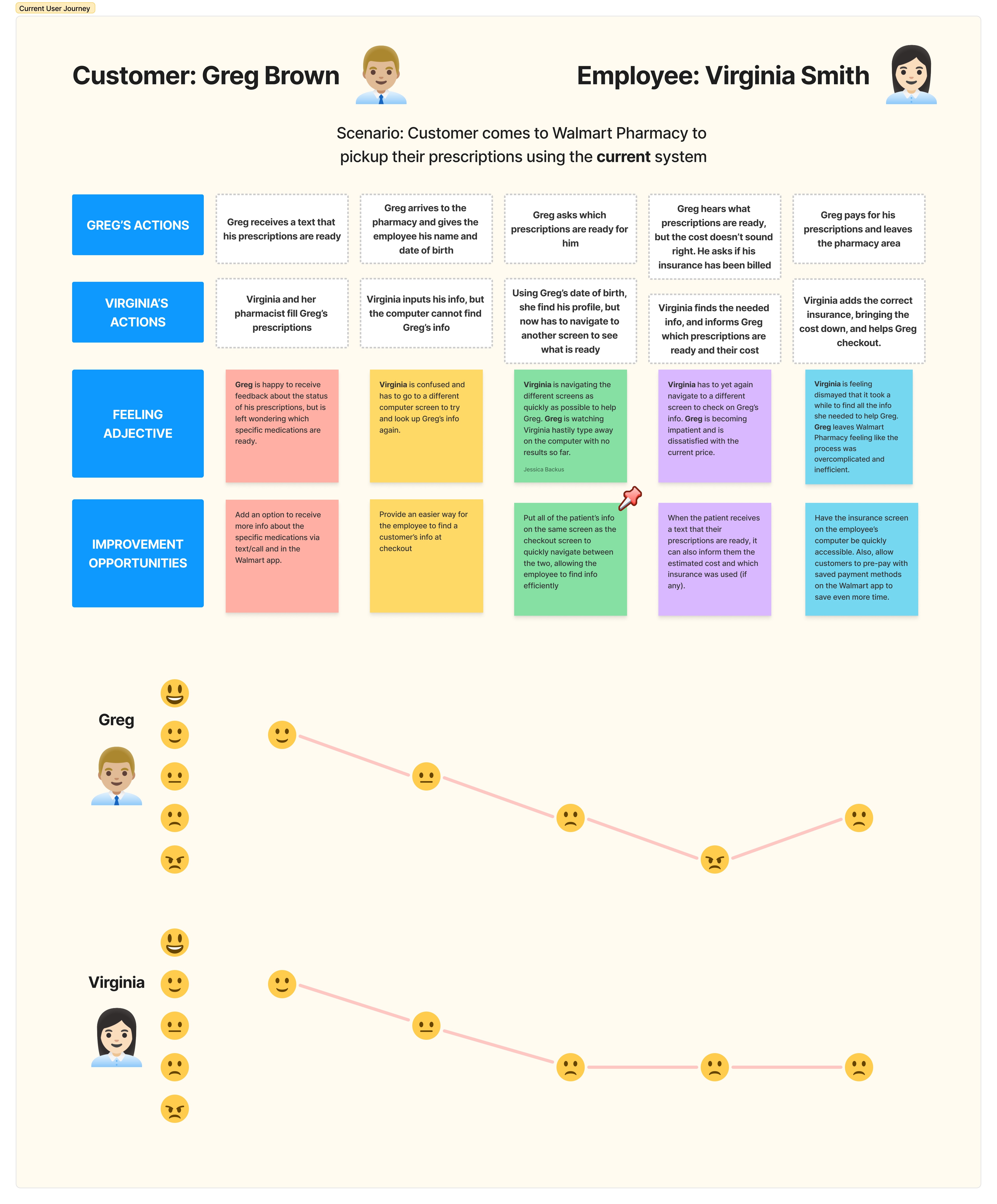
To analyze the issues with the current user journey, as well as ideate on some solution to those issues, I made a journey map consisting of both the pharmacy technician and the customer. This allowed me to look for problems and ideas for both sides of the experience.

To analyze the issues with the current user journey, as well as ideate on some solution to those issues, I made a journey map consisting of both the pharmacy technician and the customer. This allowed me to look for problems and ideas for both sides of the experience.

To analyze the issues with the current user journey, as well as ideate on some solution to those issues, I made a journey map consisting of both the pharmacy technician and the customer. This allowed me to look for problems and ideas for both sides of the experience.

Issues I identified from this journey map include:

Issues I identified from this journey map include:

Issues I identified from this journey map include:

When the pharmacy technician has a hard time finding the patient's info, they have to navigate between multiple screens to find the info, which can be time consuming, making the patient wait longer.

When the pharmacy technician has a hard time finding the patient's info, they have to navigate between multiple screens to find the info, which can be time consuming, making the patient wait longer.

Both the pharmacy technician and patient aren't sure what insurance was used, as those details are not shown on the checkout screen or in the patient's texts.

Both the pharmacy technician and patient aren't sure what insurance was used, as those details are not shown on the checkout screen or in the patient's texts.

The potential solutions I identified from creating this user journey map:

The potential solutions I identified from creating this user journey map:

The potential solutions I identified from creating this user journey map:

Make the checkout screen and user profile screen easy to swap between to easily access both during the checkout process.

Make the checkout screen and user profile screen easy to swap between to easily access both during the checkout process.

Give more feedback to patients via text, email, call, etc., including what insurance was used and the cost of their prescriptions.

Give more feedback to patients via text, email, call, etc., including what insurance was used and the cost of their prescriptions.

The Plot Thickens: It's Not Just a Software Problem

The Plot Thickens: It's Not Just a Software Problem

The Plot Thickens: It's Not Just a Software Problem

What began as a straightforward software redesign for Walmart pharmacy quickly evolved into something much more comprehensive. Through my research with customers and pharmacy technicians, I uncovered that the core issues weren’t just interface problems—they all traced back to fundamental breakdowns in the customer pickup experience itself.


This revelation transformed the entire project scope: what started as a simple UX/UI redesign had become a full service design initiative, requiring me to reimagine the entire pickup journey rather than just polish the digital interface.

Meet the Other Half of the Story

Meet the Other Half of the Story

Meet the Other Half of the Story

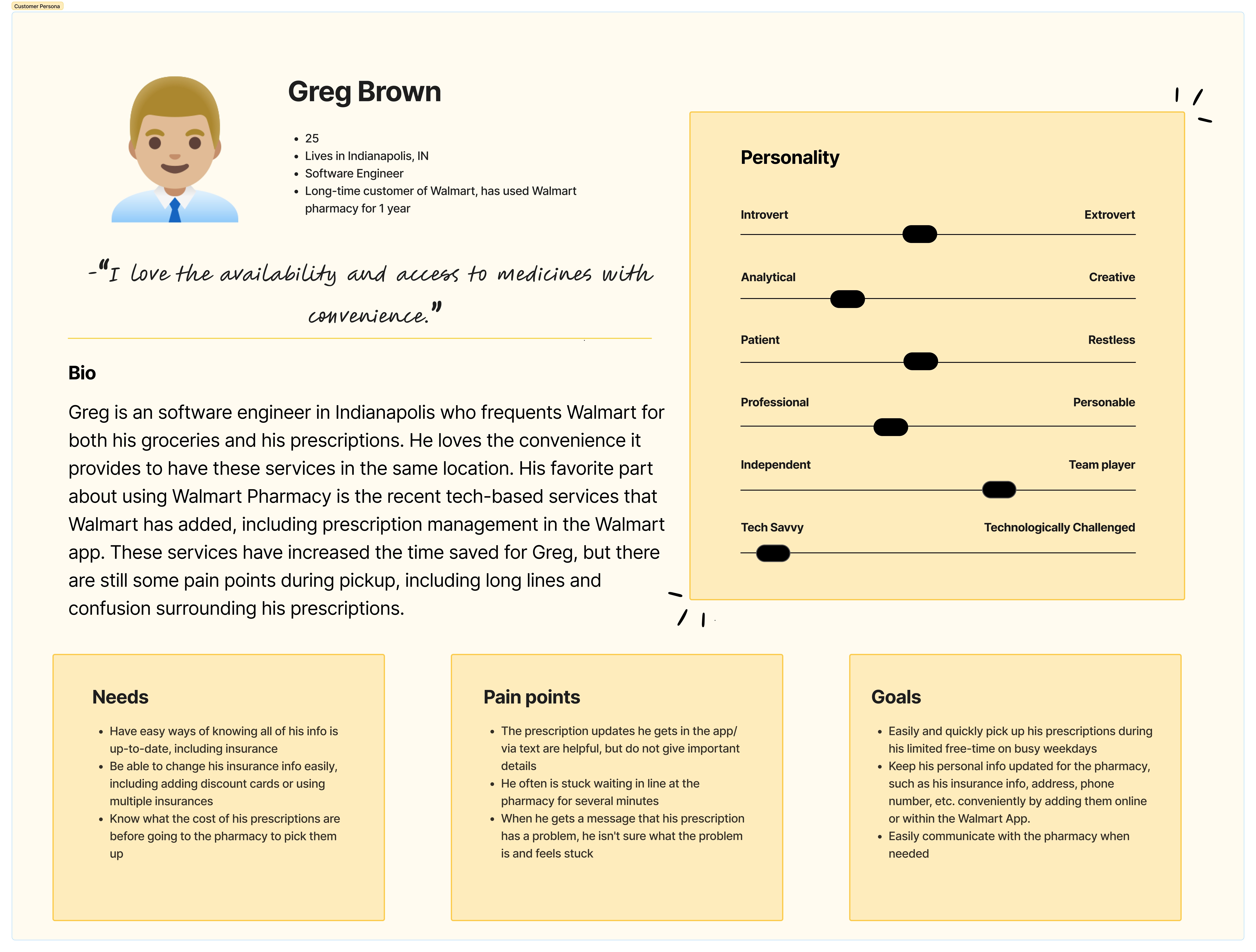
After identifying my problem scope, I determined that I also need to analyze my other user group: the customers. Similarly to the pharmacy technician persona, I made a customer persona based on my daily interactions with them, as well as some findings from the survey I created.

After identifying my problem scope, I determined that I also need to analyze my other user group: the customers. Similarly to the pharmacy technician persona, I made a customer persona based on my daily interactions with them, as well as some findings from the survey I created.

After identifying my problem scope, I determined that I also need to analyze my other user group: the customers. Similarly to the pharmacy technician persona, I made a customer persona based on my daily interactions with them, as well as some findings from the survey I created.

The Patient: Greg

The Patient: Greg

The Patient: Greg

Greg's Main goals are:

Greg's Main goals are:

Greg's Main goals are:

  • Easily and quickly pick up his prescriptions during his limited free-time on busy weekdays

  • Keep his personal info updated for the pharmacy while also keeping his personal info safe/private

  • Easily communicate with the pharmacy/pharmacists when needed

  • Easily and quickly pick up his prescriptions during his limited free-time on busy weekdays

  • Keep his personal info updated for the pharmacy while also keeping his personal info safe/private

  • Easily communicate with the pharmacy/pharmacists when needed

Greg's Pain Points are:

Greg's Pain Points are:

Greg's Pain Points are:

  • Lack of specific feedback: the prescription updates he gets in the app/via text are helpful, but do not give important details

  • Wait times: He often is stuck waiting in line at the pharmacy for several minutes

  • Feeling stuck: when he gets a message that his prescription has a problem, he isn't sure what the problem is and feels stuck

Patient task flow analysis: prescription pickup

Patient task flow analysis: prescription pickup

Patient task flow analysis: prescription pickup

To further analyze the current experience the patient has, I did a simple task flow analysis to find opportunities for improvement.

To further analyze the current experience the patient has, I did a simple task flow analysis to find opportunities for improvement.

The opportunities I identified:

The opportunities I identified:

The opportunities I identified:

Give other options to find patient info

Give other options to find patient info

Instead of relying on name and date of birth to find a patient's info, utilize the app, texts, or emails to send the patient a confirmation code, QR code, etc. to be used to quickly find the patient's profile.

Instead of relying on name and date of birth to find a patient's info, utilize the app, texts, or emails to send the patient a confirmation code, QR code, etc. to be used to quickly find the patient's profile.

Skip the wait

Skip the wait

Improve the customer's experience by reducing the amount of time waiting. Provide options to save a spot in line. Then, have a dedicated pickup spot for these customers (vs. those with other needs). Also, display the estimated current wait time, as well as a predicted wait time, based on the typical busiest hours.

Improve the customer's experience by reducing the amount of time waiting. Provide options to save a spot in line. Then, have a dedicated pickup spot for these customers (vs. those with other needs). Also, display the estimated current wait time, as well as a predicted wait time, based on the typical busiest hours.

From the survey data collected, one of the biggest complaints that patients have is the wait time at the pharmacy. Both of these options provide opportunities to save time for both the patient and the pharmacy technicians.

Exploring Ideas and Prototypes: Pharmacy Software

Exploring Ideas and Prototypes: Pharmacy Software

Exploring Ideas and Prototypes: Pharmacy Software

Because my initial goal was to redesign the pharmacy software, the first ideation activity I did was to create a mockup/prototype of what the improved Connexus software would look like, including the patient's profile.

Because my initial goal was to redesign the pharmacy software, the first ideation activity I did was to create a mockup/prototype of what the improved Connexus software would look like, including the patient's profile.

The Initial Prototype

The Initial Prototype

The Initial Prototype

What If We Borrowed from the Best?

What If We Borrowed from the Best?

After uncovering that the biggest problems lie within the pickup process, I made the checkout screens my priority. Once I shifted focus to this, I decided to do a competitive analysis of a few e-commerce giants' checkout screens: Walmart's (to also be brand-consistent), Amazon's, and Shopify's.

After uncovering that the biggest problems lie within the pickup process, I made the checkout screens my priority. Once I shifted focus to this, I decided to do a competitive analysis of a few e-commerce giants' checkout screens: Walmart's (to also be brand-consistent), Amazon's, and Shopify's.

From this competitive analysis, I found a pattern:

From this competitive analysis, I found a pattern:

From this competitive analysis, I found a pattern:

These e-commerce sites have a similar layout and features.

These e-commerce sites have a similar layout and features.

They all three have the "checkout" details on the right side (outlined in red), including the cost breakdown. On the left, they feature details about the products being ordered (outlined in blue) except for Shopify, as it has shipping info instead, which makes sense as the other two websites require you to be logged into an account and Shopify is made for quick purchases— no account needed.

Improve the customer's experience by reducing the amount of time waiting. Provide options to save a spot in line both online and in store. Then, have a dedicated pickup spot for these customers (vs. those with other needs). Also, display the estimated current wait time, as well as a predicted wait time, based on the typical busiest hours.

Building Something Better (With a Little AI Help)

Building Something Better (With a Little AI Help)

Building Something Better (With a Little AI Help)

After discovering this pattern, I made a second prototype with the help of AI. I engineered detailed prompts with my findings and needs and I was given screens like the ones below:

After discovering this pattern, I made a second prototype with the help of AI. I engineered detailed prompts with my findings and needs and I was given screens like the ones below:

After discovering this pattern, I made a second prototype with the help of AI. I engineered detailed prompts with my findings and needs and I was given screens like the ones below:

The Prototype 2.0

The Prototype 2.0

The Prototype 2.0

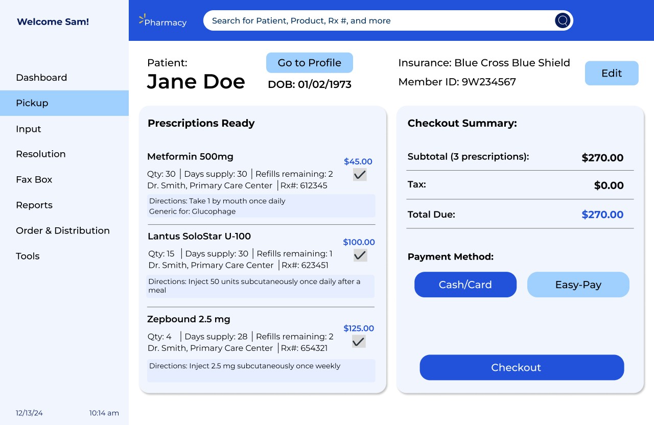
From these screens, I created a second updated prototype with a checkout screen that follows the patterns of the aformentioned e-commerce websites.

From these screens, I created a second updated prototype with a checkout screen that follows the patterns of the aformentioned e-commerce websites.

From these screens, I created a second updated prototype with a checkout screen that follows the patterns of the aformentioned e-commerce websites.

Things that were changed:

Things that were changed:

Things that were changed:

  • Tab Bar Location: changed to be a vertical sidebar to keep it consistent with the current UI, and have all key features easily accessible

  • Added "go to checkout" button: for patients that already have prescriptions ready, for fast and easy checkout

  • "Next Due date" timing: a common question patients have is "when is 'xyz' prescription due?" or "what all is due to be refilled?" Currently, technicians have to calculate/estimate when the next due date is and if there is a lot of prescriptions, this easily becomes confusing. By calculating and displaying this for them, it decreases their cognitive load, and expedites the refilling/pickup process.

  • Checkout screen that aligns with Walmart branding and e-commerce best practices: The checkout screen shows the total cost breakdown, the ability to remove/add prescriptions, and select which payment method the customer prefers.

  • Ability to change insurance during checkout, and apply to all prescriptions: to fix the issue of technicians having to back out of the checkout screen and navigate back to the patient's info to change their insurance, this button has been added to the checkout screen.


Beyond the Screen: Rethinking the Entire Experience

Beyond the Screen: Rethinking the Entire Experience

Beyond the Screen: Rethinking the Entire Experience

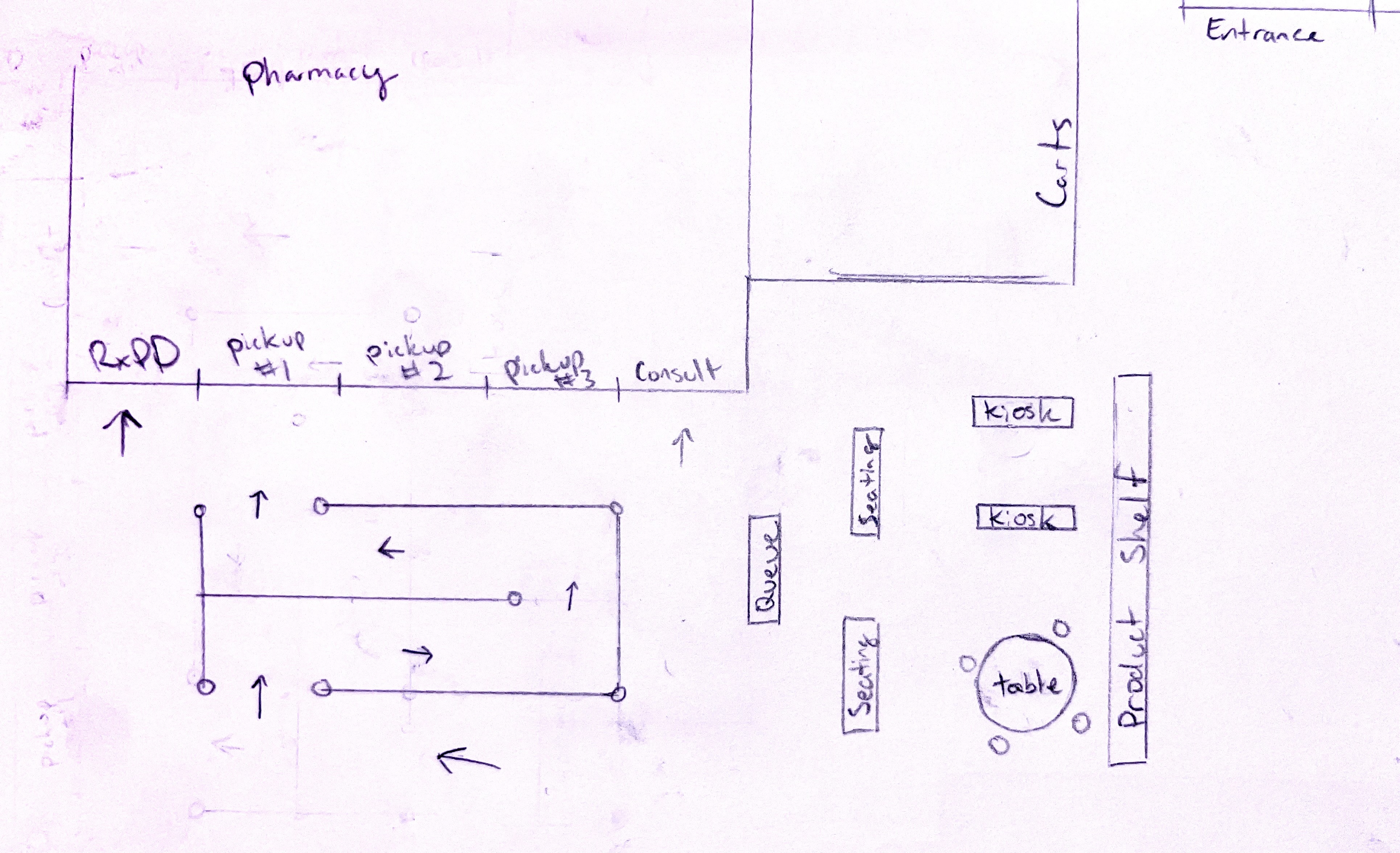
After creating the pharmacy software prototypes, I then ideated on how to improve the customers' experience. The biggest complaint that I got from my survey results and from observations is long waiting times. To help with this, I explored a few ideas to make the wait better, including a waiting area, a queue screen, and a self-help kiosk.

After creating the pharmacy software prototypes, I then ideated on how to improve the customers' experience. The biggest complaint that I got from my survey results and from observations is long waiting times. To help with this, I explored a few ideas to make the wait better, including a waiting area, a queue screen, and a self-help kiosk.

After creating the pharmacy software prototypes, I then ideated on how to improve the customers' experience. The biggest complaint that I got from my survey results and from observations is long waiting times. To help with this, I explored a few ideas to make the wait better, including a waiting area, a queue screen, and a self-help kiosk.

Pictured above: sketches of the store layout with added waiting area and kiosk

Pictured above: sketches of the store layout with added waiting area and kiosk

Pictured above: sketches of the store layout with added waiting area and kiosk

The In-store Kiosk

The In-store Kiosk

The kiosk features:

The kiosk features:

The kiosk features:

  • Prescription Status Checks: Provides customers without the Walmart app a quick way to check their prescription status, serving those who lack smartphones or don't have sufficient storage space to download the app

  • Vaccine Scheduling: Allows customers to easily request and schedule vaccines without needing the mobile application

  • Prescription Expediting: Enables customers to move their prescriptions to the front of the pharmacy work queue for faster filling

  • Queue Management System: Issues numbered tickets to customers after expediting prescriptions, allowing them to track their position in line while maintaining HIPAA compliance by avoiding the use of names

Putting Ideas to the Test

Putting Ideas to the Test

Updated Pharmacy Software

Updated Pharmacy Software

To test my ideas, I performed user testing with pharmacy employees using the second prototype of the software shown above, giving them the task of checking out a prescription for a customer that needs to update their insurance during checkout. From the user testing, I found:

To test my ideas, I performed user testing with pharmacy employees using the second prototype of the software shown above, giving them the task of checking out a prescription for a customer that needs to update their insurance during checkout. From the user testing, I found:

To test my ideas, I performed user testing with pharmacy employees using the second prototype of the software shown above, giving them the task of checking out a prescription for a customer that needs to update their insurance during checkout. From the user testing, I found:

The pharmacy technicians liked having all features in one window, versus having to toggle between them.

The pharmacy technicians liked having all features in one window, versus having to toggle between them.

The pharmacy technicians liked having all features in one window, versus having to toggle between them.

Having the "add vaccine" feature was convenient

Having the "add vaccine" feature was convenient

Having the "add vaccine" feature was convenient

Liked the overview of the patients profile, including the current insurance and the "next due date" feature- the current way to find the next due date is to simply calculate it. They said this feature would save them time.

Liked the overview of the patients profile, including the current insurance and the "next due date" feature- the current way to find the next due date is to simply calculate it. They said this feature would save them time.

Liked the overview of the patients profile, including the current insurance and the "next due date" feature- the current way to find the next due date is to simply calculate it. They said this feature would save them time.

The "add new insurance to all prescriptions" button was very appreciated as it would save even more time, as the current system requires you to do it manually for each prescription.

The "add new insurance to all prescriptions" button was very appreciated as it would save even more time, as the current system requires you to do it manually for each prescription.

The "add new insurance to all prescriptions" button was very appreciated as it would save even more time, as the current system requires you to do it manually for each prescription.

The auto refill toggle on the patient profile confused users who mistook it to be the same as the prescription selector on the checkout screen. This toggle should be relocated or redesigned for clarity.

The auto refill toggle on the patient profile confused users who mistook it to be the same as the prescription selector on the checkout screen. This toggle should be relocated or redesigned for clarity.

The auto refill toggle on the patient profile confused users who mistook it to be the same as the prescription selector on the checkout screen. This toggle should be relocated or redesigned for clarity.

Overall, the technicians agreed that these features could easily save them ~5 minutes during checkout— a 20-25% decrease in time (from the average time of ~20 min found from the survey).

Overall, the technicians agreed that these features could easily save them ~5 minutes during checkout— a 20-25% decrease in time (from the average time of ~20 min found from the survey).

Overall, the technicians agreed that these features could easily save them ~5 minutes during checkout— a 20-25% decrease in time (from the average time of ~20 min found from the survey).

In-store Kiosk and Queue Management

In-store Kiosk and Queue Management

I also concept tested the Kiosk with pharmacy employees and customers to gauge their interest in the idea. The feedback I got included:

I also concept tested the Kiosk with pharmacy employees and customers to gauge their interest in the idea. The feedback I got included:

Seating option: Some customers prefer to wander around and shop, while others would prefer to sit and wait, especially if it is just for a few minutes, or if they came to Walmart specifically for the pharamacy.

Seating option: Some customers prefer to wander around and shop, while others would prefer to sit and wait, especially if it is just for a few minutes, or if they came to Walmart specifically for the pharamacy.

Kiosk Use: If it is more busy, then they are more likely to use the kiosk to help skip the line. But if it's not busy, then they are more inclined to simply talk to a pharmacy employee.

Kiosk Use: If it is more busy, then they are more likely to use the kiosk to help skip the line. But if it's not busy, then they are more inclined to simply talk to a pharmacy employee.

Kiosk Use: If it is more busy, then they are more likely to use the kiosk to help skip the line. But if it's not busy, then they are more inclined to simply talk to a pharmacy employee.

Concerns about HIPPA privacy: any kiosks/queue screens would need to ensure the customer is anonymous to other customers, to ensure their privacy.

Concerns about HIPPA privacy: any kiosks/queue screens would need to ensure the customer is anonymous to other customers, to ensure their privacy.

Concerns about HIPPA privacy: any kiosks/queue screens would need to ensure the customer is anonymous to other customers, to ensure their privacy.

Loitering: while the seating area can be beneficial, some show concern about having non-customers using the space.

Loitering: while the seating area can be beneficial, some show concern about having non-customers using the space.

Loitering: while the seating area can be beneficial, some show concern about having non-customers using the space.

Adding Multiple Languages: By adding a screen that lets the user select their language, they could also easily use the kiosk.

Adding Multiple Languages: By adding a screen that lets the user select their language, they could also easily use the kiosk.

Loitering: while the seating area can be beneficial, some show concern about having non-customers using the space.

Projected Impact:

Projected Impact:

Projected Impact:

Based on these suggested fixes and current feedback, this system could:

Based on these suggested fixes and current feedback, this system could:

Based on these suggested fixes and current feedback, this system could:

  • Decrease customer wait times by 20-25% and therefore, customer satisfaction

  • Improve onboarding— the current learning curve is steep, and an more intuitive UI can fix that

  • Reduce cognitive load for employees: better systems mean they can use their brain power to solve more important problems

  • Reduce language barriers: By providing a confirmation code or QR code for pickup, there is less potential for the pharmacy technician to make a mistake on the customer's name. Also, for the in-store kiosks, by providing different languages, the customer can also access faster service using a visual interface

With all of these factors, customers become repeat customers, staff becomes happier staff, and both customers and employees of Walmart Pharmacy can have a better healthcare experience.

With all of these factors, customers become repeat customers, staff becomes happier staff, and both customers and employees of Walmart Pharmacy can have a better healthcare experience.

With all of these factors, customers become repeat customers, staff becomes happier staff, and both customers and employees of Walmart Pharmacy can have a better healthcare experience.

What I Learned

What I Learned

What I Learned

When I first started this project, I was convinced I was tackling a straightforward UI problem. The pharmacy software looked dated, the technicians complained about it constantly, and I figured a sleek redesign would solve everything. I was wrong—and that misconception taught me more about design than any successful project could have.


Service Design Requires Orchestrating People, Not Just Interfaces: My breakthrough came when I realized I was designing for a service, not just a screen. The customer wasn't just a recipient—they were an active participant. This taught me that:

  • Sometimes the best solution for employees isn't best for customers

  • The kiosk idea only emerged when I stopped thinking about software and started thinking about the entire pickup journey

  • Service design means choreographing interactions between people, not just people and screens


Key Realizations About Research

  • Observation beats assumptions: Watching a real technician struggle revealed the checkout screen wasn't the problem—it was inability to access patient info during checkout

  • "Simple" solutions are complex to implement: The kiosk idea seemed obvious until testing revealed HIPAA concerns, loitering issues, and varying customer preferences

  • Users can't always articulate frustrations: People struggle to explain workflow problems until you watch them experience it


The Metrics That Matter Most: I initially focused on quantifiable metrics like time savings, but the most meaningful feedback came from a technician who said, "I'm old and bad with technology, and this was very simple." Good design doesn't just make tasks faster—it makes people feel more capable of doing their jobs well.

If I Had More Time…

If I Had More Time…

If I Had More Time…

If I had more time to work on this project more, these would be my next steps:

Make a fully-functioning prototype: My prototypes are currently limited to a few features, but I'd love the opportunity to expand upon them more using a page builder such as Replo or PageFly (as these add logic and already have useful premade assets), implement more features, and address even more issues I found with the current pharmacy software.


Mobile App Integration: Some of the features in the kiosk could easily translate to the mobile app, and so I would create some prototypes to demonstrate this.


Do even more research/testing: I would expand my user groups to take into account many different demographics including age, location, non-English speakers, customers with disabilities, and more.

If I had more time to work on this project more, these would be my next steps:

If I had more time to work on this project more, these would be my next steps: